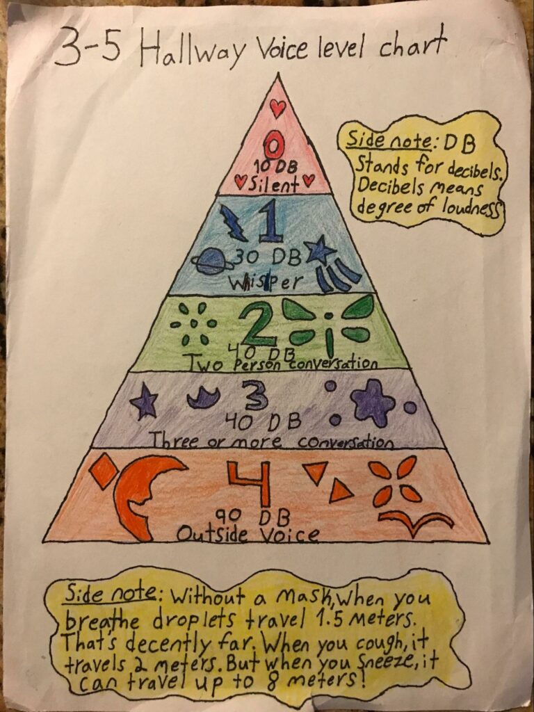
Side note: “Without a mask, when you breathe droplets travel 1.5 meters. That’s decently far. When you cough, to travels 2 meters. But when you sneeze, it can travel up to 8 meters!”
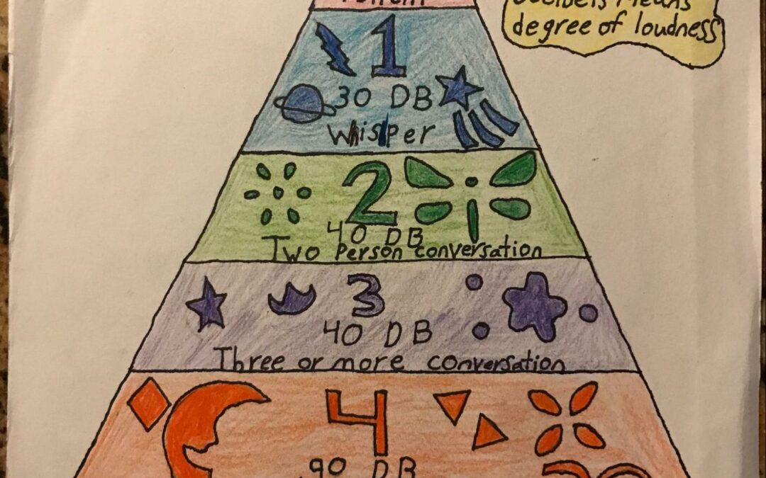
“This diagram is to give information about how loud you should be in the hallway. I want the information to be noticed so the diagram is bright and colorful. I made the diagram that way because it is information explaining how loud we are when we speak to others. The diagram also connects voice to how the air quality is affected by the droplets we emit when speaking.“
The is an adaptation of a voice level chart that students use at the Boggs School to manage the loudness of their voice. The original chart has a range from 0 to 4 with description included. Students explored voice level and the connection to air quality by attempting to incorporate decibels (dB) and droplet spread, with or without masks. This exploration allowed students to share what they learned about contributing to clear air in a pandemic in a non-threatening way. I hope you find it helpful!
By: Naja, 8th Grade
Teacher: Charlene Jones, The James and Grace Lee Boggs School, Detroit
Subject: Math
Theme: General Place-Based Education
Type: Diagram


i had no idea that could hapen
nice! I also love the symbols. amazing!
The colors are definitely eye-catching and I agree with Ethan that the math represented in a pyramid makes it easier to understand. I wonder if there is a way to capture the loudness of the decibels with the meters that droplets travel so that people know how far they’re sending their droplets depending on how loud they’re talking.
I really like how you’ve used colors and symbols to express noise level intensity. Super cool!
WOW! I love this visual. For me the pyramid shape really communicated the math ideas you were sharing effectively. Thanks for teaching me about this and for communicating your mathematical thinking so clearly! Not easy to do! At least for me 🙂
I am so inspired by all of the different ways that information can be communicated. You are using visual tools and models to convey your understanding in a clear and concise manner, which definitely grabs my attention. Excellent!